
As a long-time admirer of Arc’teryx, I recently took the liberty of reimagining the brand’s digital store experience. While shopping online, I noticed that the distinct Arc’teryx DNA—so clear in the brand’s ethos and products—wasn’t fully expressed in the site’s current design. This led me to ask: What would it feel like if the digital storefront was unmistakably Arc’teryx, in both form and function?

I began by dissecting the three major consumer touch-points, the homepage, category page, and the product detail page.
A few things Is noticed that I specifically wanted to reinvent were:
- Navigation to feel more seamless
- Copy and CTA formatting on image ares
- Product grid simplification & innovation
- Rounded corners on images to promote focus on product
⁃ Instilling brand DNA into every detail and interaction.
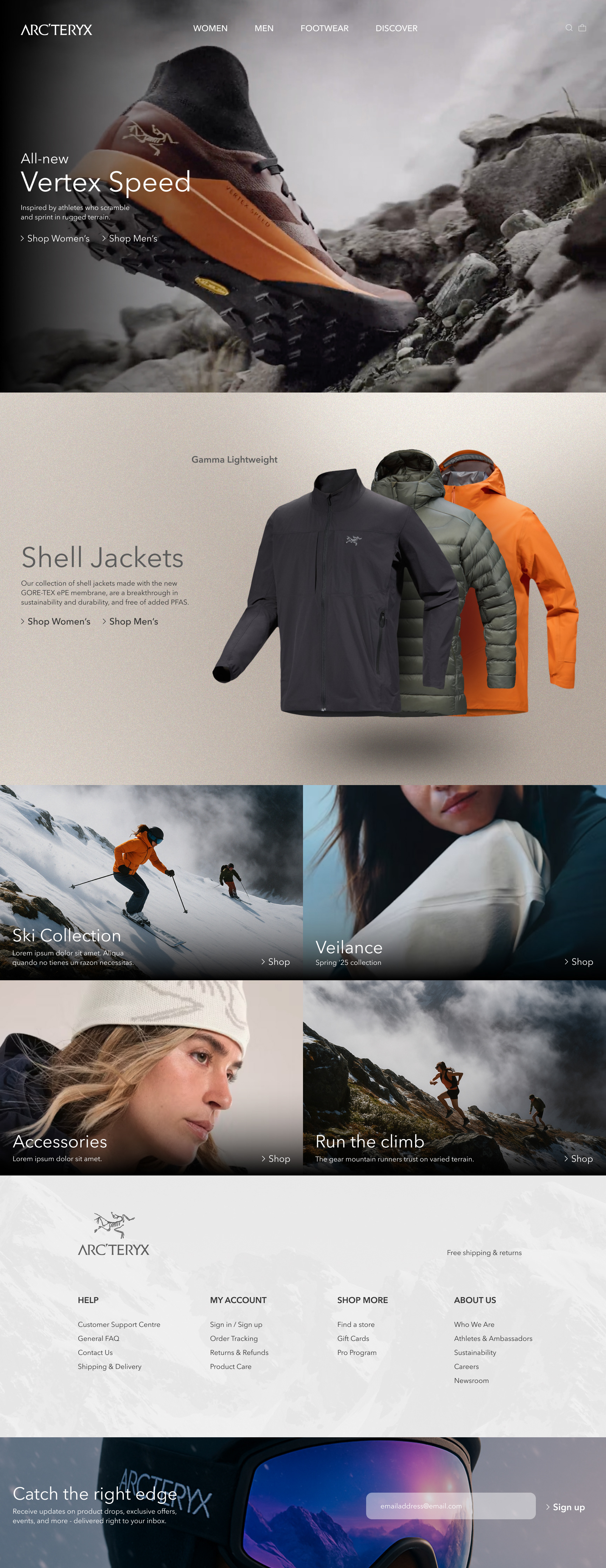
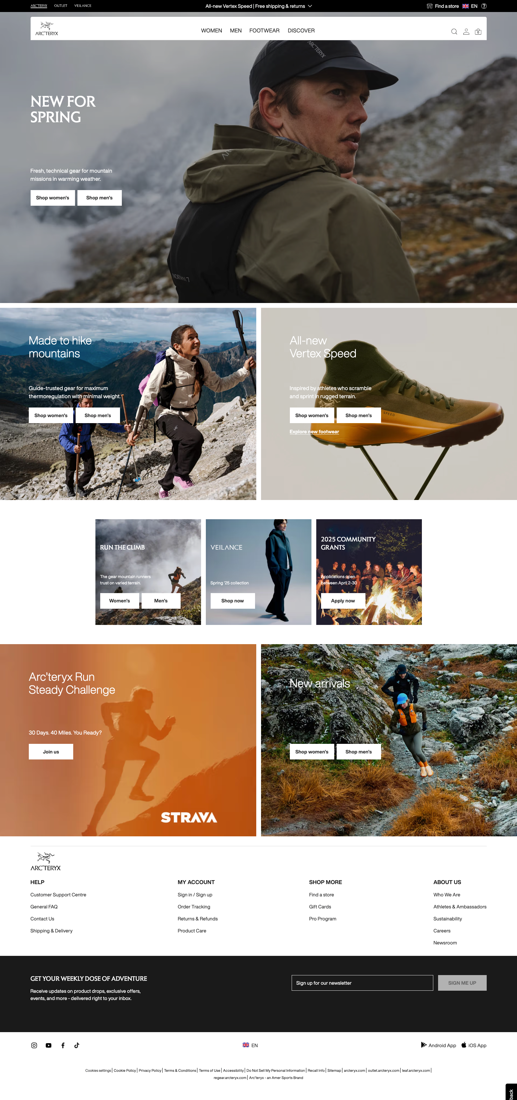
The homepage opens with a full-bleed image to immediately command attention and anchor the user in the brand’s most important story. CTAs were reimagined as large, text-based links to keep visuals unobstructed and maintain narrative flow.
Beneath the hero, I introduced an interactive section allowing users to explore product categories at a glance, inviting deeper exploration based on interest. The page concludes with a streamlined content module and a subtly textured footer—designed to evoke the Arc’teryx spirit and reconnect users to their core purpose: being on the mountain.
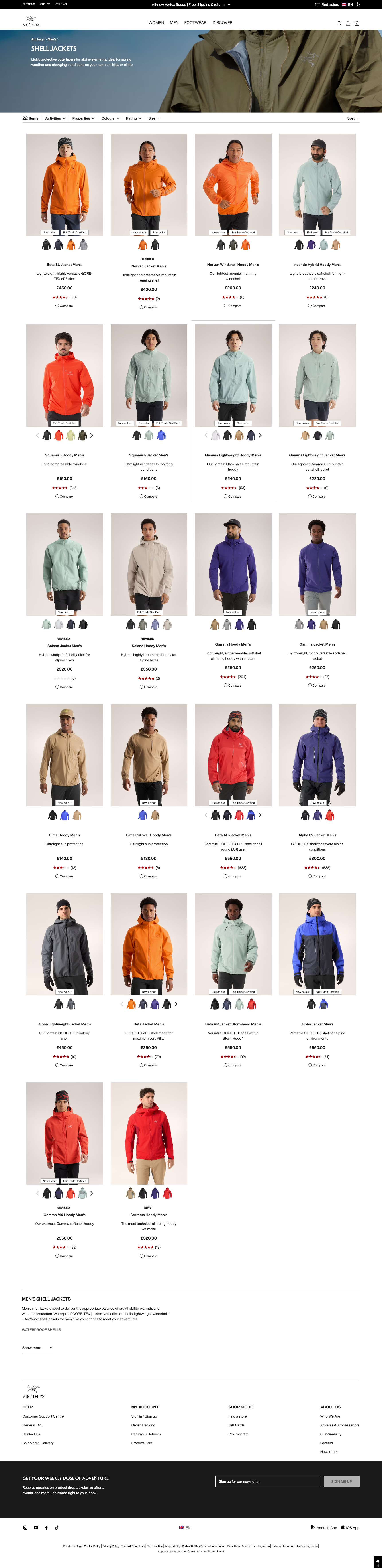
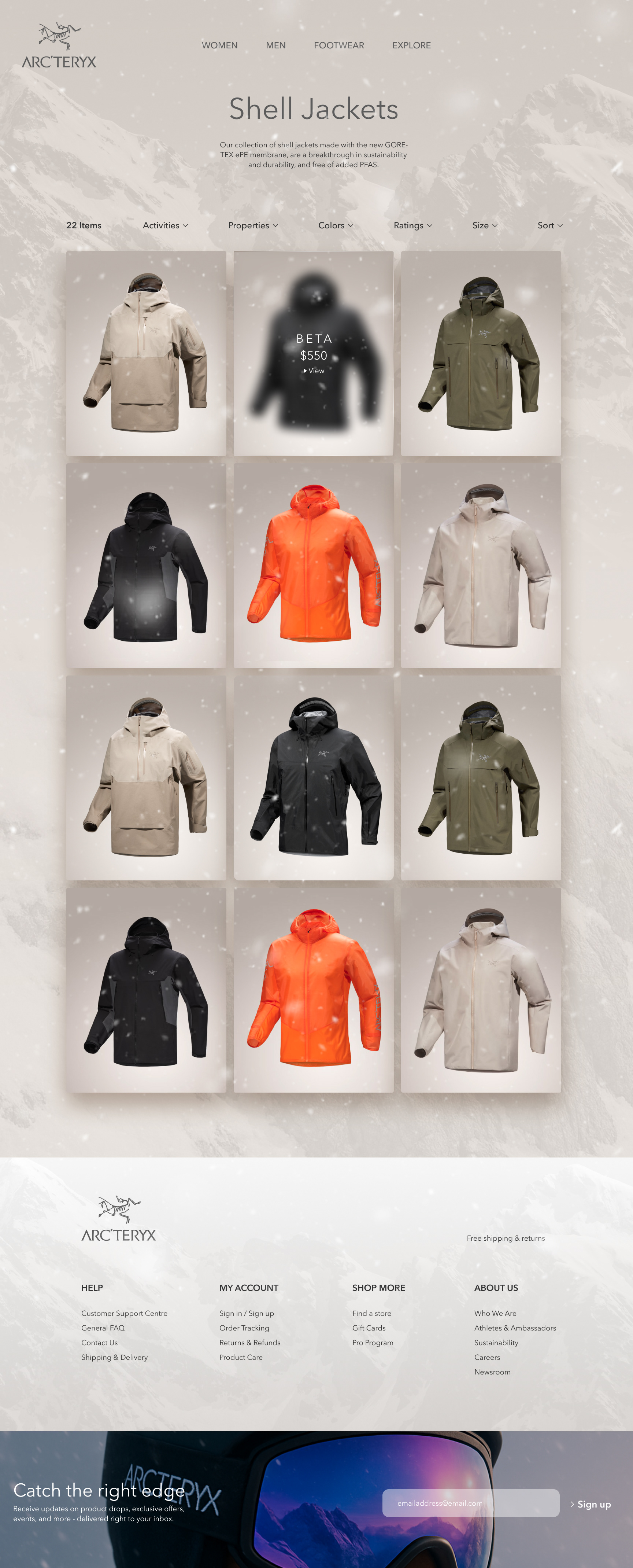
The category page was stripped of its banner to create a seamless, textured backdrop. A short description at the top provides context, while uniform product imagery encourages visual clarity and focus. Non-essential information is withheld upfront, allowing users to engage with the product visually—mirroring the way we discover items in-store: we see, feel, imagine, and then seek details. This layout prioritizes emotion-led discovery before transactional behavior.
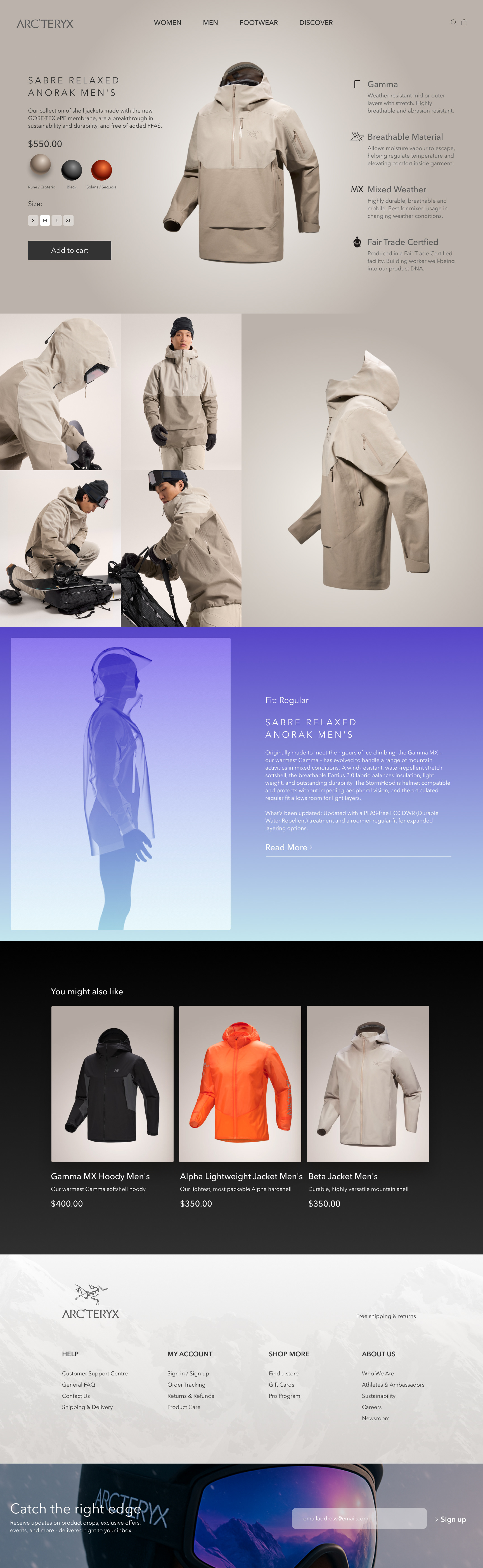
The redesigned PDP places the product front and center, presented in a clean, unobstructed hero section with multiple color views and core details. Deeper content—typically buried—is elevated into a gallery-style layout to highlight the product’s story and form. To complement the technical details, I incorporated contrasting colors and motion design, building a more immersive and emotionally resonant product experience. Every design choice is intended to elevate excitement and deepen desire at each touchpoint of the consumer journey.